eBay • Selling Experience
Making it easy for sellers to list $9B of merchandise yearly
With an active marketplace of over 100 million buyers globally, eBay is great place for sellers to make money. In 2016 eBay was looking for ways to inspire new sellers and to optimize its complex listing process for existing consumer and business sellers. Feedback from sellers revealed that it took too long to get an item listed on eBay, and overall conversion was trending down. In an ever-increasingly competitive e-commerce space, change was necessary. I led our design team, in collaboration with the research and engineering teams, to solve for sellers’ needs by developing simple, innovative ways to improve the entire experience.
Gathering a holistic understanding of the eBay seller experience
Working closely with the selling team's dedicated user research team, I gathered a wealth of information about our sellers through interviews, ethnographic research, competitive audits, and heuristic evaluations. The UI was too complex - especially for first-time users, and was cluttered with features that most users didn’t require, which negatively affected completion and conversion. I led workshops with our product, research and engineering teams to center us around our goals and generate ideas to solve the customer problem.
In house visits to existing sellers captured their fervent passion for selling as well as their frustrations in using eBay's listing tools.
Team workshops allowed for ideas to be shared and helped teams align on the customer problem.
A result of the multiple workshops led to a transformative strategy for how our team would make selling a great experience for seasoned shopkeepers and newbies alike.
Simplify, simplify, simplify. But also, elevate quality
We developed a strategy that leveraged the power of eBay’s data-driven services to create a simpler, efficient selling experience. eBay's catalog containing millions of products, and marketplace activity could be used to provide recommendations or pre-fill details such as pricing, item details, and shipping information. I developed designs that explored how an approach could simplify the listing process for sellers.
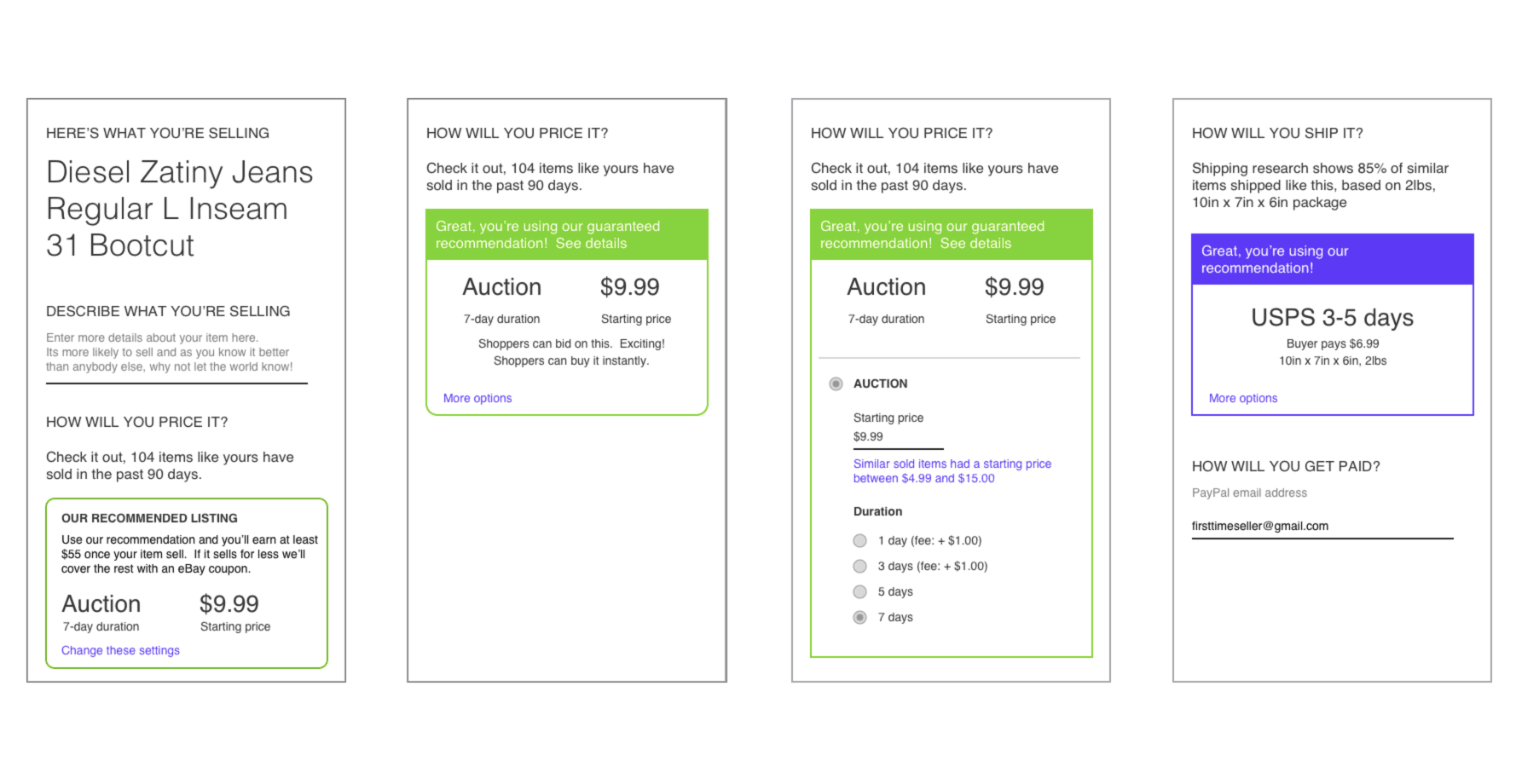
Very early wireframes already captured concepts such as a mobile-first view, a recommendation engine, more inviting content tone, and an information hierarchy giving prominence to selections.
Low-fidelity mocks further explored how to bring attention to the recommended settings, as well as find a balance between simplifying choices while providing the ability to let advanced users apply additional options using UI techniques like progressive disclosure.
The selling tool was a single screen with seven key sections where the seller needed to add input and make selections. I created multiple screens in Sketch to detail the interaction and the different states of each section.
Re-imagining the entire selling platform from start to finish
Usability tests of the initial designs highlight a number of challenges: some users did not recognize the recommendations presented, and some did not trust the recommendations, often leaving to do their own research with outside sources to inform their choices for pricing. I continued to iterate on designs to make sure that recommendations were easily noticed, and looked at providing information natively so that sellers could trust the recommendations.
Early prototypes gave a tangible vision of the future selling experience that our team intended to deliver.
Multiple prototypes were presented to sellers in user testing to get feedback about the key aspects of the selling tool.
Multiple prototypes were presented to sellers in user testing to get feedback about the key aspects of the selling tool.
Building out the complete experience across web, tablet and phone
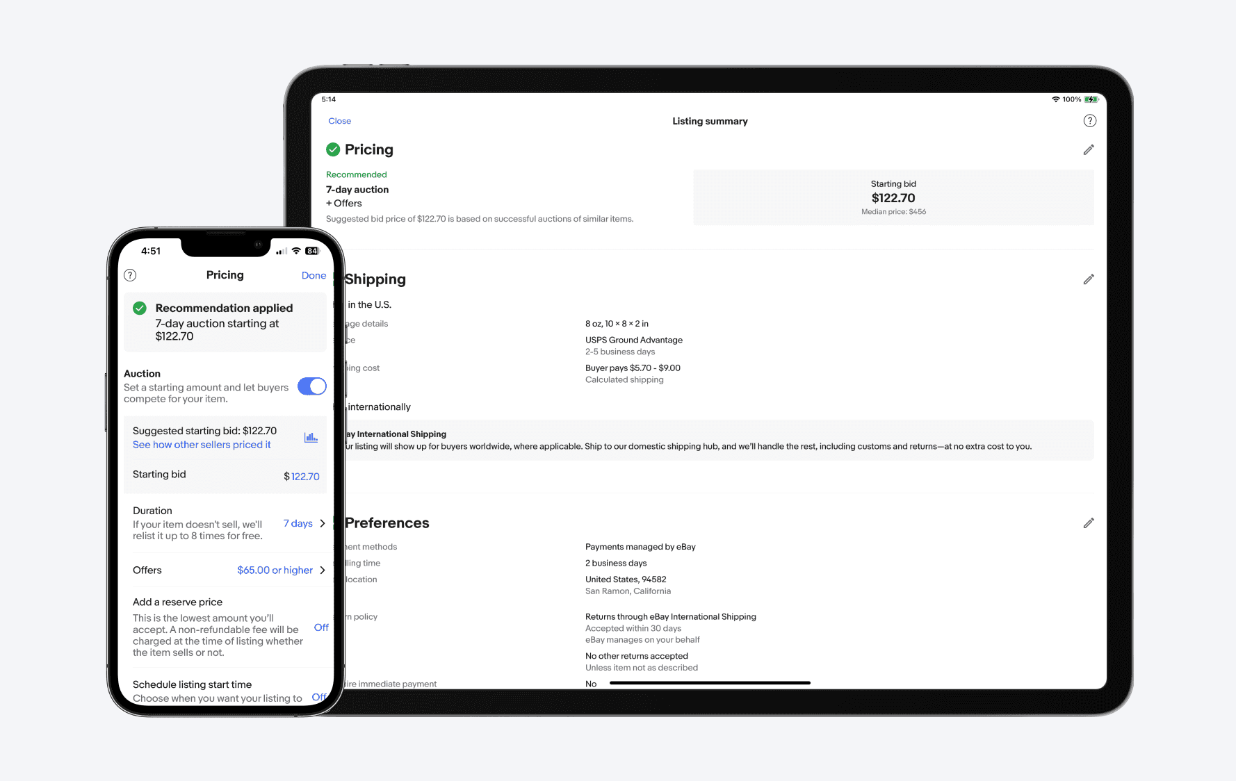
After lots of testing and iteration, I landed on a simpler experience powered by data-driven recommendations that supercharged the selling experience for both new and experienced sellers. While the designs were focused on mobile, I designed a unified experience that would be consistent across desktop web, mobile web, and tablet screens.
Our product and technology teams continue to stay on the cutting edge of technology to leverage our product catalog as well as our vast data on what buyers want in order to benefit our sellers. We’re excited to get our updated app into sellers’ hands to make it as quick and easy as possible to list and sell their items.
- Kelly Vincent, Vice President of Consumer Selling Products
The main selling page on eBay gives sellers a birds-eye view of their performance, including how much money they have made, tasks and a summary of their inventory.
When sellers list an item on eBay, all of the necessary information needed to publish it appears in a single view.
The iPhone and iPad apps leverage the device's ability to take photos so sellers can easily show the items in their listing.
eBay will give a recommeded price and format for the item being sold based on the performance of similar recently sold items.
The similar sold items view gives sellers the latest market trends for the item, so they can make and informed price determination without having to leave to do outside research.
Sellers have a wealth of choices and options to ship their items to buyers, but eBay will recommend settings based on community patterns.
Conclusion
For the first time in eBay history, the consumer selling experience was re-imagined holistically with an end-to-end approach. With 13 million new listings added via eBay’s mobile platform per week, selling was the 2nd companywide initiative in 2016, and our team received a lot of visibility, funding, and resources to drive the experience forward. At the end of 2016 version 1 of the new selling experience slow-ramped to the US market. Throughout 2017 we focused on increasing completion and conversion metrics, geo-expansion to our top markets, and rolling our learnings into our native apps. The redesign I led built a foundation for what exists today, and set up the selling experience for future expansion.
By building this Platform, we can better ensure quality and consistency in the selling flow; add new features faster with greater velocity; remove friction; and provide a more seamless experience overall. For long time sellers, they will now have access to listings on mobile and more consistent experiences. And for new sellers, they will have less of a learning curve.
- Pete Thompson, CTO eBay


